
An autumn wedding comes with a built-in sense of atmosphere with the help of softer light, richer textures and a natural depth of colour that does a lot of the work for you.
Here are 20 autumn wedding colours that we love:
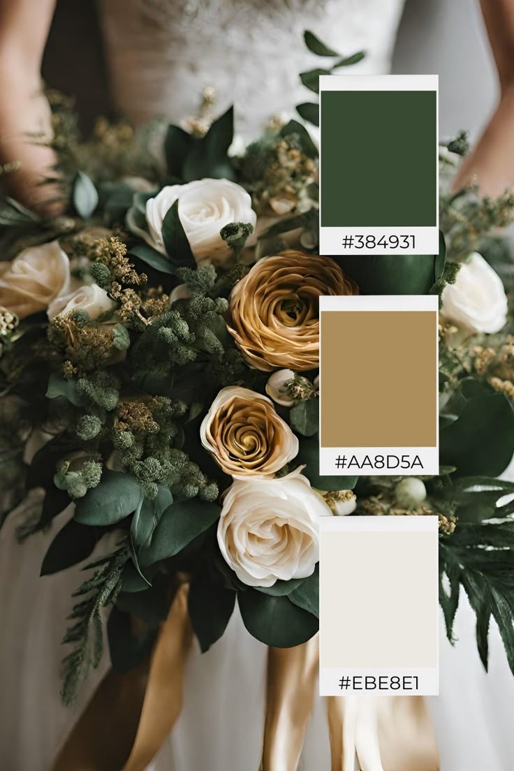
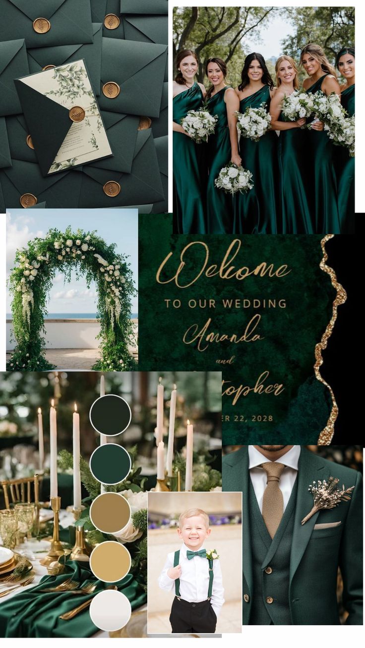
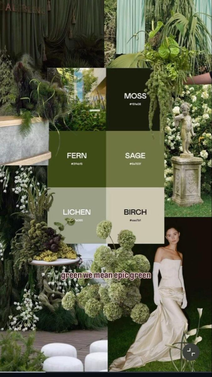
1. Forest green
Forest green is a strong foundational colour for autumn weddings, especially in outdoor or garden settings. It pairs well with natural materials like wood and linen, and works seamlessly alongside gold accents or softer neutrals to create balance.
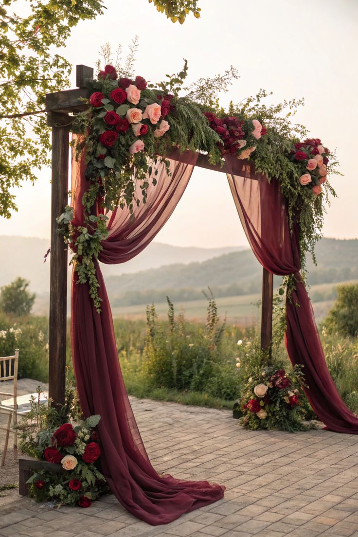
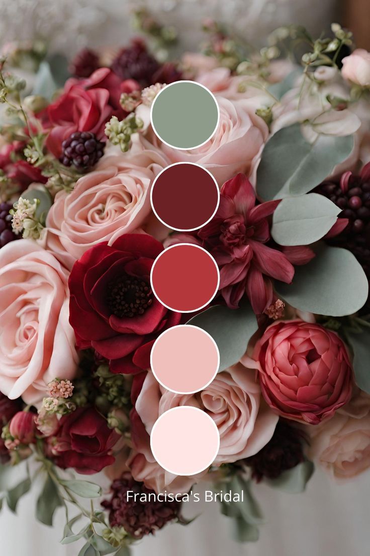
2. Burgundy
Burgundy remains one of the most reliable autumn tones, thanks to its depth and versatility. It translates well across florals, table linens and bridal party attire, and can be paired with lighter shades like blush or peach to soften its intensity.
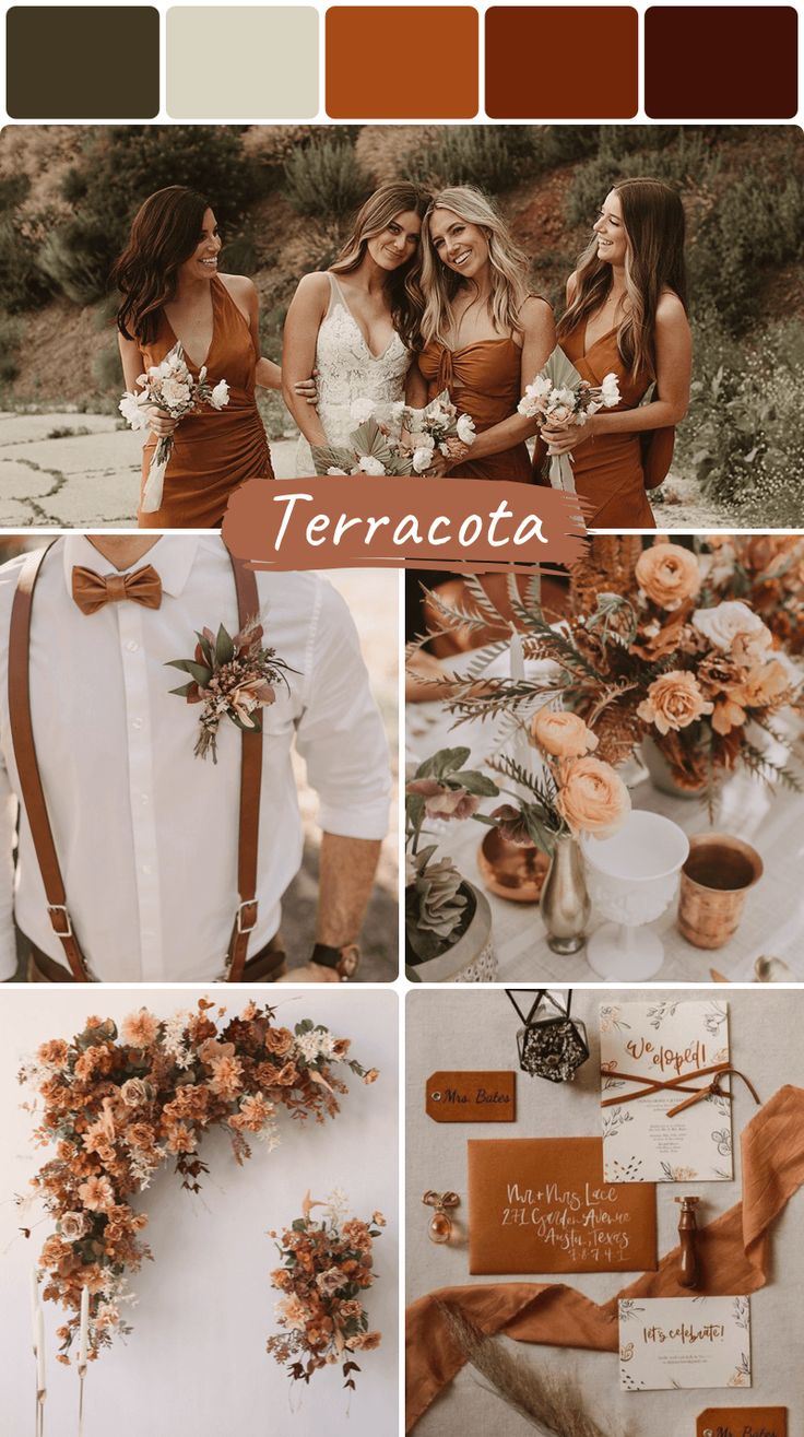
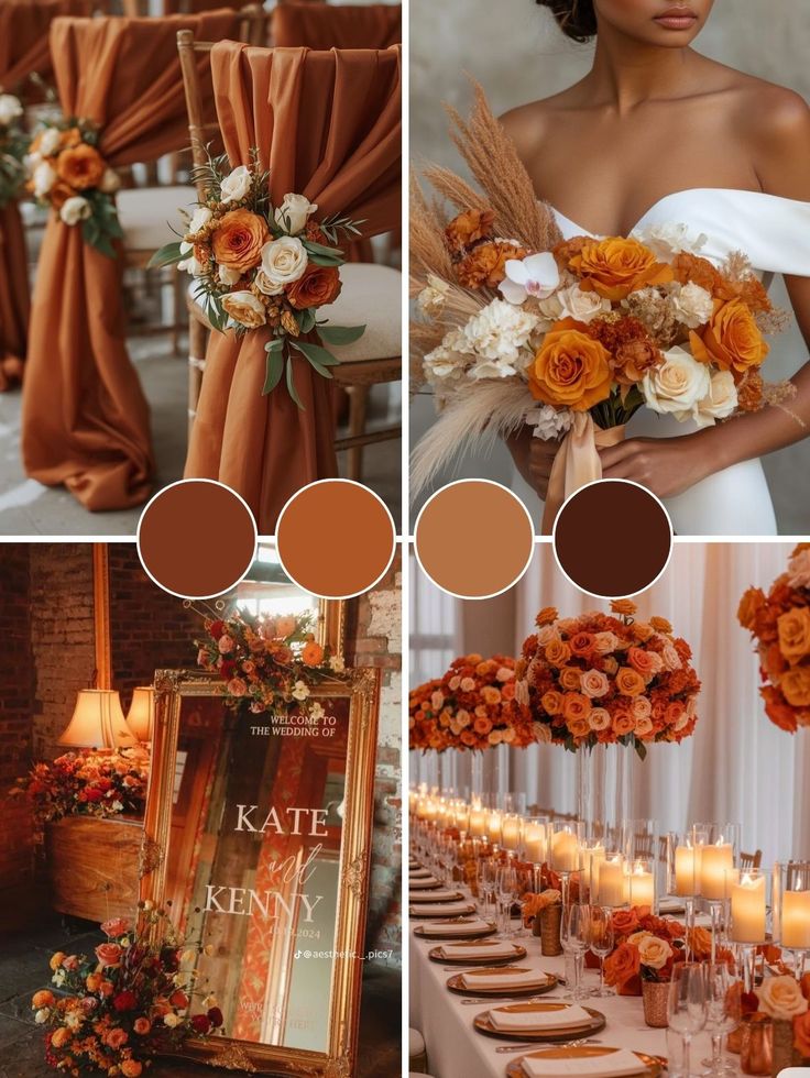
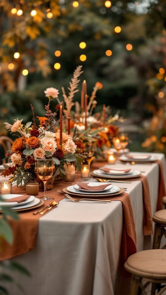
3. Terracotta
Terracotta introduces warmth without feeling overly bold. It works particularly well in relaxed or bohemian settings, especially when combined with textured elements like ceramics, rattan and dried florals.
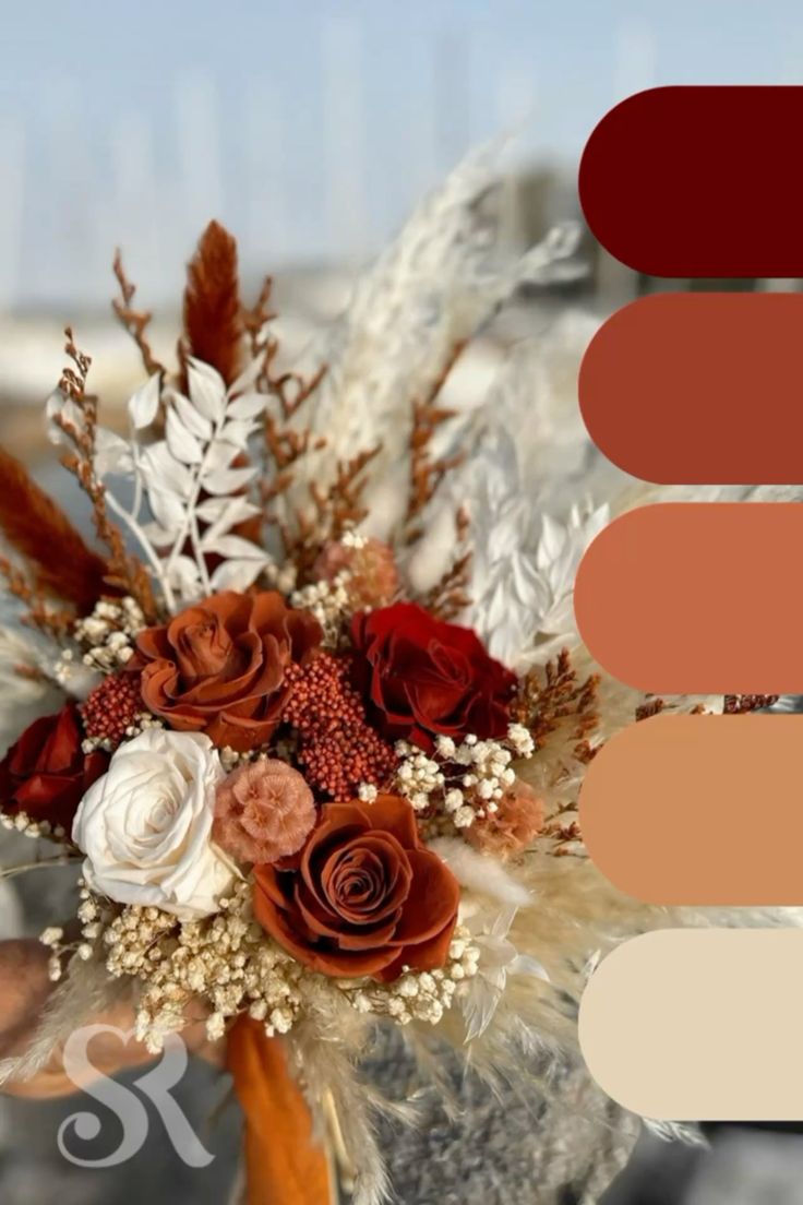
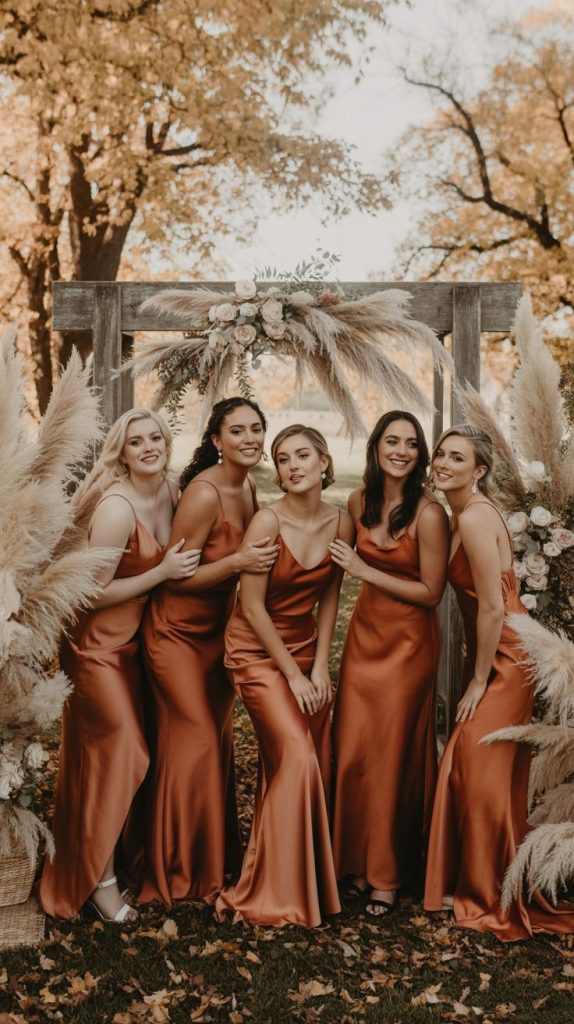
4. Rust
Rust sits between orange and brown, making it a more muted way to bring warmth into your palette. It’s especially effective in fabrics — from bridesmaid dresses to napkins — and complements both neutrals and deeper tones.
5. Amber
Amber brings a soft, golden warmth that enhances the overall atmosphere rather than dominating it. It works best through details like glassware, candles or subtle décor accents.
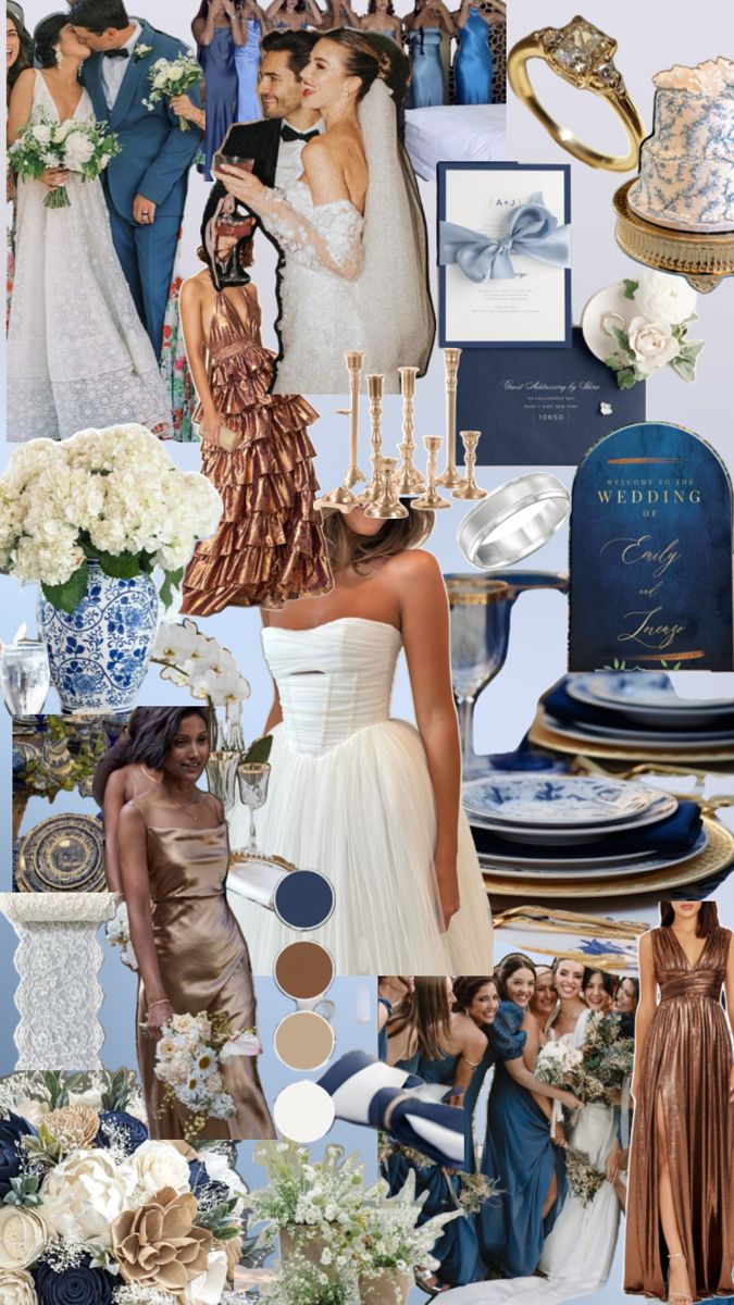
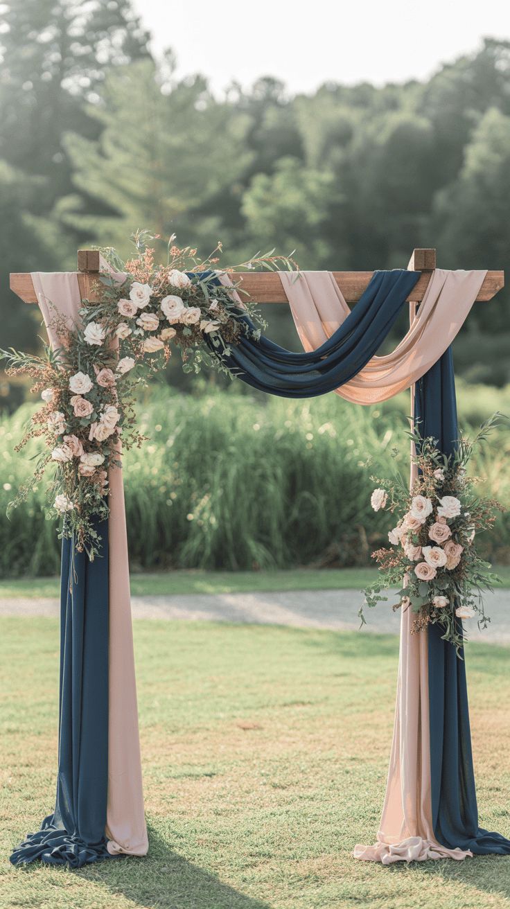
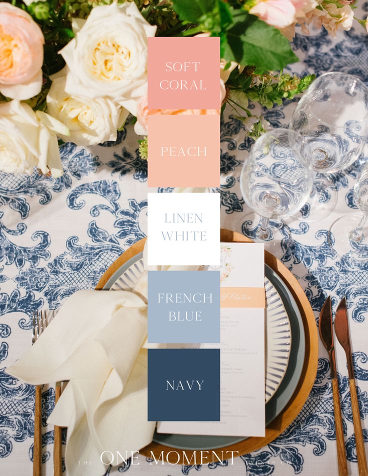
6. Navy
Navy provides contrast and structure within an autumn palette. It anchors warmer tones like rust, marigold or burgundy, and works particularly well in more formal or evening settings.
7. Emerald green
Emerald green adds a sense of richness and formality. It pairs well with metallics like gold, as well as classic combinations like white or deep red, making it a versatile choice across different styles of weddings.
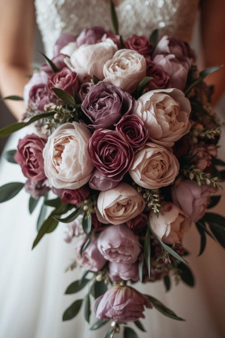
8. Plum
Plum introduces a deeper, more romantic layer to your palette. It works best when combined with other jewel tones or balanced with softer shades like mauve or dusty rose.
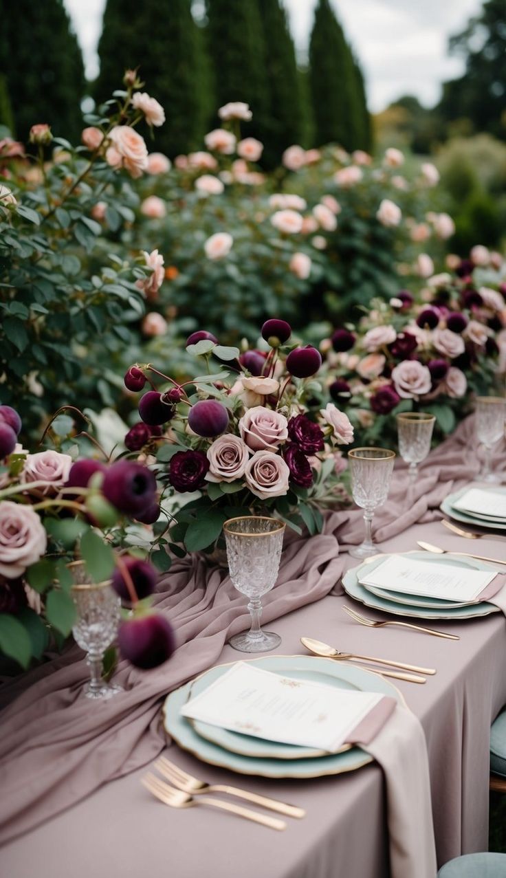
9. Mauve
Mauve offers a softer alternative to traditional autumn shades. Its muted undertones make it easy to pair with greys, lilacs and warmer neutrals, adding depth without overpowering the palette.
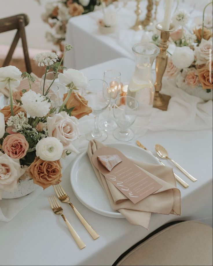
10. Copper
Copper brings in a metallic element that still feels grounded and seasonal. It’s most effective in table settings — think cutlery, vases or candle holders — where it adds warmth and texture.
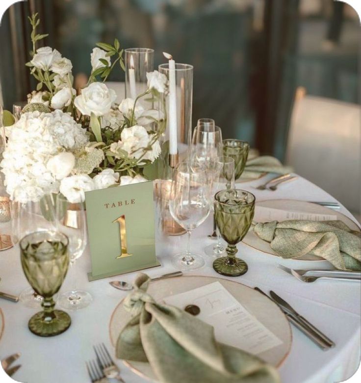
11. Sage green
Sage green acts as a neutral base within an autumn palette. It complements both warm and cool tones, making it a practical choice for larger elements like table linens or bridal party outfits.
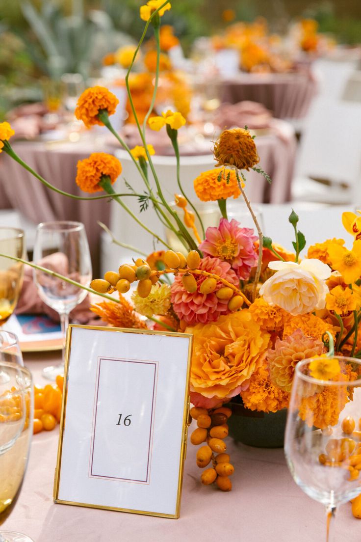
12. Marigold
Marigold introduces a bold, vibrant contrast to deeper autumn shades. It works best when used intentionally in smaller elements, such as florals or stationery, to avoid overwhelming the overall look.
13. Dusty rose
Dusty rose bridges the gap between soft and structured. It pairs well with stronger tones like burgundy or navy, adding a subtle warmth that keeps the palette from feeling too heavy.
14. Camel
Camel tones create a warm, understated base that works across both modern and rustic settings. When layered with similar neutrals, it creates a cohesive and inviting look.
15. Gold
Gold is one of the easiest ways to elevate an autumn palette. It can be introduced through small details like flatware and decor accents, or used more prominently for a more refined finish.

16. Olive green
Olive green has a slightly richer undertone than other greens, making it well-suited to autumn. It pairs naturally with warm neutrals and works well across both decor and fashion elements.
17. Cranberry
Cranberry adds depth with a slightly brighter edge than burgundy. It works best as an accent colour, bringing contrast to neutral or earth-toned palettes.
18. Peach
Peach offers a softer, more unexpected addition to autumn palettes. When paired with deeper tones like navy or rust, it helps to lighten the overall look without losing warmth.
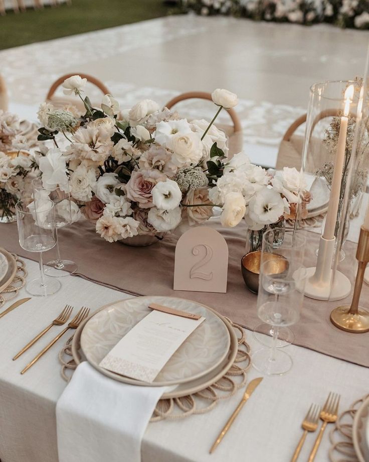
19. Taupe
Taupe provides a neutral foundation that allows other colours to stand out. It works particularly well in linens and stationery, where it sets the tone without competing for attention.
20. Cinnamon
Cinnamon captures the warmth typically associated with autumn. It works well across multiple elements — from fashion to florals — and pairs easily with both neutrals and richer tones.
Bringing it together
A strong autumn palette doesn’t rely on one standout colour, but rather on how each shade works alongside the next. Start with a base, build in contrast, and use texture to enhance the overall effect.