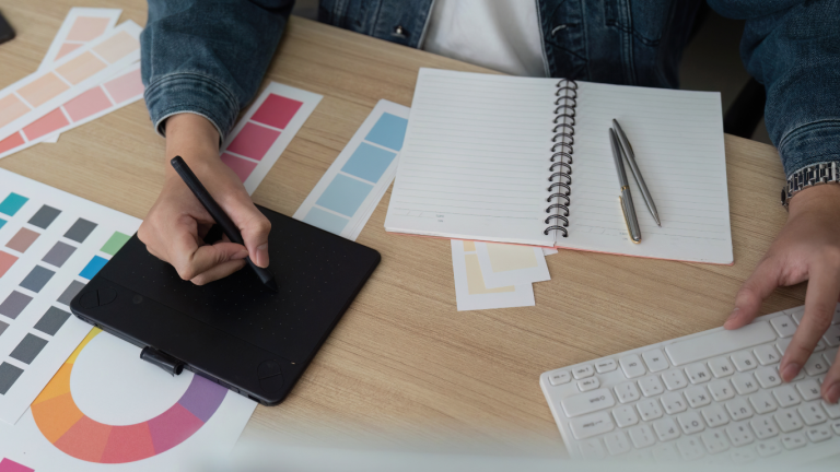
Weddings are evolving and so are their color stories. Where soft neutrals once reigned supreme, 2025 is ushering in a bold new era of moody, jewel-toned palettes: think emerald greens, deep burgundy, sapphire blues, and rich plum. These sumptuous hues bring drama, depth, and emotion to a celebration, creating unforgettable atmospheres.
Below, we explore how this shift is playing out in South Africa, how to blend statement color with timeless style, and offer ready-to-use palette “recipes” you can adapt to your wedding.
Seasonal Color Trends in South Africa: Summer vs. Winter
South Africa’s climates and landscapes lend themselves beautifully to changing color moods each season. Local vendors and blogs are already spotting these shifts.
Summer / Warm Seasons
-
Brighter and lighter jewel tones, emerald, teal, fuchsia—pair beautifully with lush greenery and abundant natural light.
-
Accent with metallics (rose gold, warm copper) and softer neutrals to keep the look refined.
-
According to a South African bridal trend blog, summer 2025 palettes are seeing vibrant choices like coral, terracotta, moss green, and dusty lavender.
-
Yet even summer palettes are leaning away from pastel toward more saturated hues.
Winter / Cooler Seasons
-
Deep, moody tones shine in winter: burgundy, sapphire, forest green, plum.
-
Velvet textures, dark wood, and richer metallics (antique gold, bronze) help enhance warmth and coziness.
-
Jewel-tone table settings, emerald, amethyst, ruby are gaining popularity for winter ceremonies.
-
South African décor sources also highlight “bold color” as a strong ongoing trend, with deep purples and jewel accents making statement touches.
Tip: If your wedding straddles seasons (e.g. early autumn or late spring), bridge neutrals (cream, taupe, soft grey) help soften transitions between bold and subtle hues.
Blending Dramatic Tones with Classic Aesthetics
Using deep, bold hues doesn’t mean giving up elegance or timelessness. Here are strategies to strike balance:
-
Anchor with Neutrals
Use ivory, soft beige, or light grey as your base (linens, draping, walls) and let jewel tones appear in pops — napkins, florals, chair ties. -
Limit Bold Accents
Choose one or two primary dramatic colors and pair them with supportive secondary shades. Avoid overcrowding with all saturations. -
Texture & Depth
Mix velvet, silk, matte and glossy finishes. A velvet tablecloth in deep emerald with satin napkins and a metallic charger creates luscious contrast. -
Metallics
Gold, brass, bronze or even pewter can lend elegance and lighten darker palettes. Use sparingly — frames, flatware, candleholders. -
Florals & Foliage as Transition Tools
Use greenery, soft neutral blooms, and subtle tonal gradations to bridge between bold and classic. -
Lighting & Ambience
Warm lighting softens saturated hues. Uplights, candles, and warm white string lights can make jewel tones feel inviting, not heavy.
Palette “Recipes”, Pairing Florals, Linens & Dress Tie-Ins
Here are some palette ideas (“recipes”) to help you mix and match florals, linens, and attire cohesively. Each recipe includes a dominant hue + accent + neutral.
| Palette Name | Dominant Hue | Accent / Secondary | Neutral / Softening Tone | Notes |
|---|---|---|---|---|
| Emerald & Blush | Emerald green | Blush pink, dusty rose | Champagne or ivory | Softens green’s intensity; blush warms up cool green |
| Burgundy & Plum | Deep burgundy | Mauve, dusty wine | Soft taupe or stone | Elegant and regal for evening weddings |
| Sapphire & Teal | Sapphire blue | Teal, aqua | Light grey or silver | Great for coastal or modern venues |
| Amethyst & Sage | Rich purple | Sage green | Cream or pale lavender | Earthy but dramatic |
| Ruby & Gold | Ruby red | Berry tones, deep rose | Warm ivory | Use gold accents to elevate richness |
How to apply these recipes:
-
Florals: Let your dominant hue guide your main blooms, then use accent tones in secondary flowers. For example: emerald foliage, blush roses, cream spray roses.
-
Linens / Napkins: Use neutrals for tablecloths; napkins or runners can carry the accent colors.
-
Bridal Party / Dresses: Bridesmaids might wear the accent color (blush), while groomsmen wear pocket squares or ties in the dominant hue (emerald).
-
Stationery & Signage: Carry the palette across welcome signs, menus, seating charts.
To keep jewel tones from feeling too heavy, incorporate touches of lighter hues like blush or cream.
Jewel tone weddings, emeralds, sapphires, amethysts—are gaining traction for their luxurious and dramatic feel.
Thoughts & Tips
-
Start with a mood board early: gather fabrics, flower photos, paint chips.
-
Order samples of linens and swatches in your intended hues to test in your venue’s lighting.
-
Work closely with your florist, designer, and lighting team to ensure the colors harmonize under different light.
-
Don’t shy away from bold tones, but be intentional. A carefully chosen dramatic palette can make your wedding unforgettable.
Featured Image: Canva

